01. INTRODUCTION
In Summer 2025, I joined Innovative Systems for my first role in User Experience Design. Naively, I expected to spend three months drawing beautiful screens. Instead, I got to solve messy, real-world problems.
System Overview
Map, Transform, Validate (MTV) is an internal data transformation tool. It was built function-first, meaning UX was an afterthought. My role was to bring a user-centered lens to the redesign.
Sprint Structure
I utilized a strict Agile methodology to manage the chaos:
- Conduct stakeholder/user interviews
- Analyze existing content & dependencies
- Define pain points & problem statements
- Research & Prototype
- Final Vision Document
02. LEARNING
For much of the first month, I spent time learning from seniors, particularly the importance of documentation in Miro and Confluence.
To serve as my baseline, I conducted a content inventory to set me up for success. This included a task analysis of the existing screens and their relationships.
Getting a little bit lost in the weeds.
To continue learning about MTV, I conducted stakeholder interviews.
PROJECT MANAGER
LEAD DEVELOPER
LEGACY USER
POTENTIAL USER
These conversations threw me into the deep end. I was trying to reconcile every opinion.
Another designer pulled me back and reminded me that it's my role to to dig deeper, understand their goals and weigh their inputs.
I was responsible for making the design decisions to solve the right problem.
03. DEFINE
BUSINESS CONTEXT
Inefficient tool is costing developer time and therefore project budget.
USER CONTEXT
Fragmentation causes lack of confidence. Users don't know where they are in the process.
PROBLEM STATEMENT
How might we create a cohesive experience that integrates Mappings, Rules, and Processes, so users can configure data transformations confidently?
04. IDEATE
Identifying Pain Points
Based on the HMW, I focused on the key pain points to address within the limited timeframe. Here's a look at one of the screens that highlighted the usability issues.
Issue Identified: Unclear labels and layout forced users to guess.
Collaborative Sketching
Working with senior designers, we conducted whiteboard sessions to generate ideas. These ideas led me to ask deeper questions when I went back to the interviews. My approach was focused on understanding how a user wants to move through this program.
Refining the Workflow
Eventually, I understood where the workflow fragmentation was happening. I created a user flow diagram that:
- > Reorganized pages into logical, task oriented sequences
- > Introduced a central mapping page
- > Integrated rules and processes into the main flow
Prominent ideas I had that incorporated this new userflow.
- Power page approach: Combine all features into one comprehensive interface.
- Guided wizard flow: Shopping cart-style stepped experience.
Power page approach
CONCEPT A
A tree structure idea intended to combine all features into one interface.
Guided wizard flow
CONCEPT B
A shopping cart style flow idea to provide a stepped experience.
Initially, the power page approach was very appealing. It felt so efficient. However, as I walked the developer through the sketch, they immediately raised flags about technical constraints. Senior designers also warned me about overwhelming users with a single, dense screen.
The guided wizard flow was a better option to move forward with.
05. PROTOTYPE
Multiple feedback rounds refined the concept while working within the constraints of an existing design system.
Eventually, I built higher-fidelity prototypes in Miro. These weren’t pixel-perfect but in a fast-paced environment they gave the developers clear patterns to implement using design system components.
The guided wizard flow turned out to be too rigid. The step-by-step wizard felt very restrictive. I instead moved towards tabs which would provide a clear flow but allow the user to work back and forth easier.
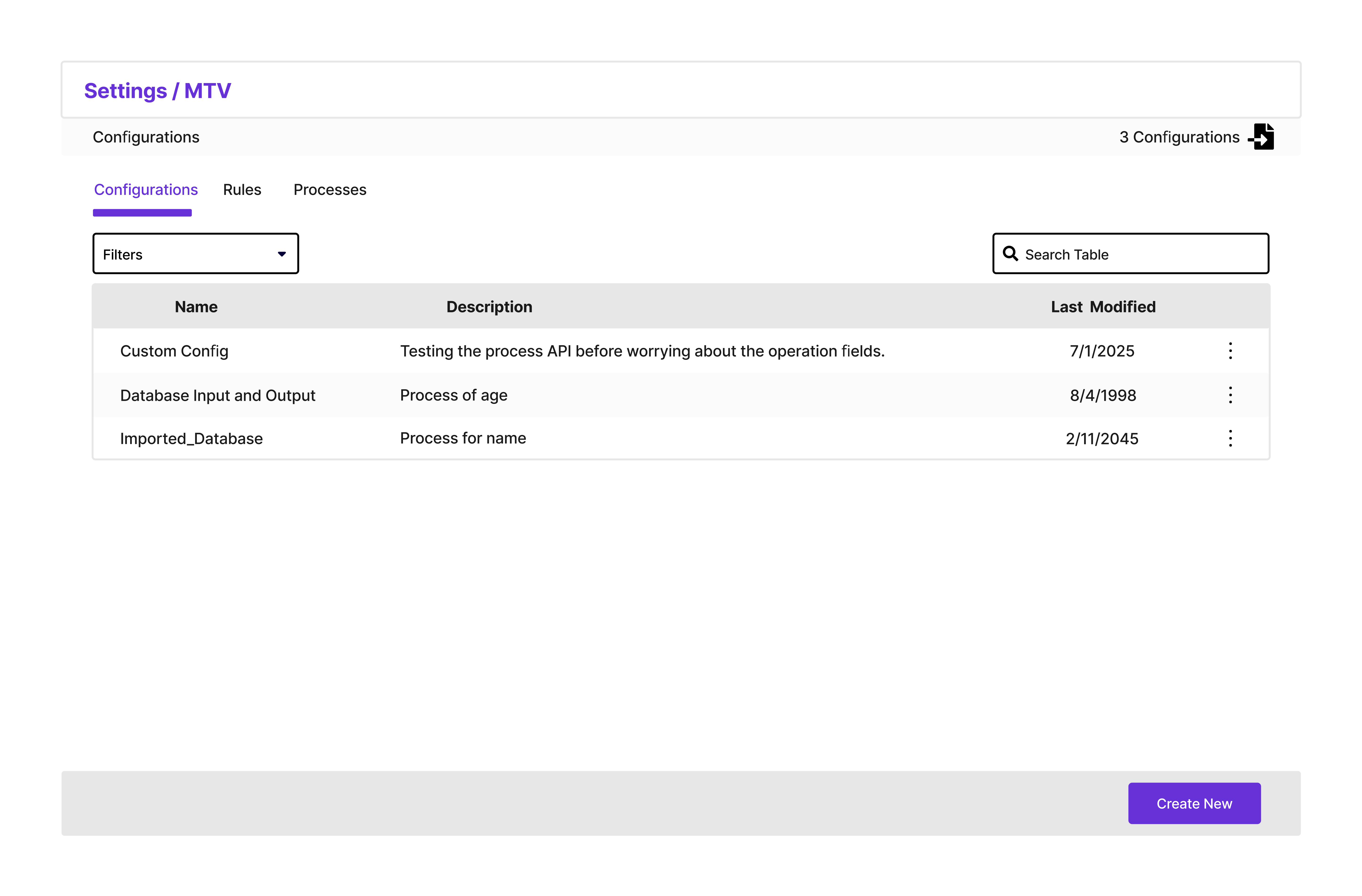
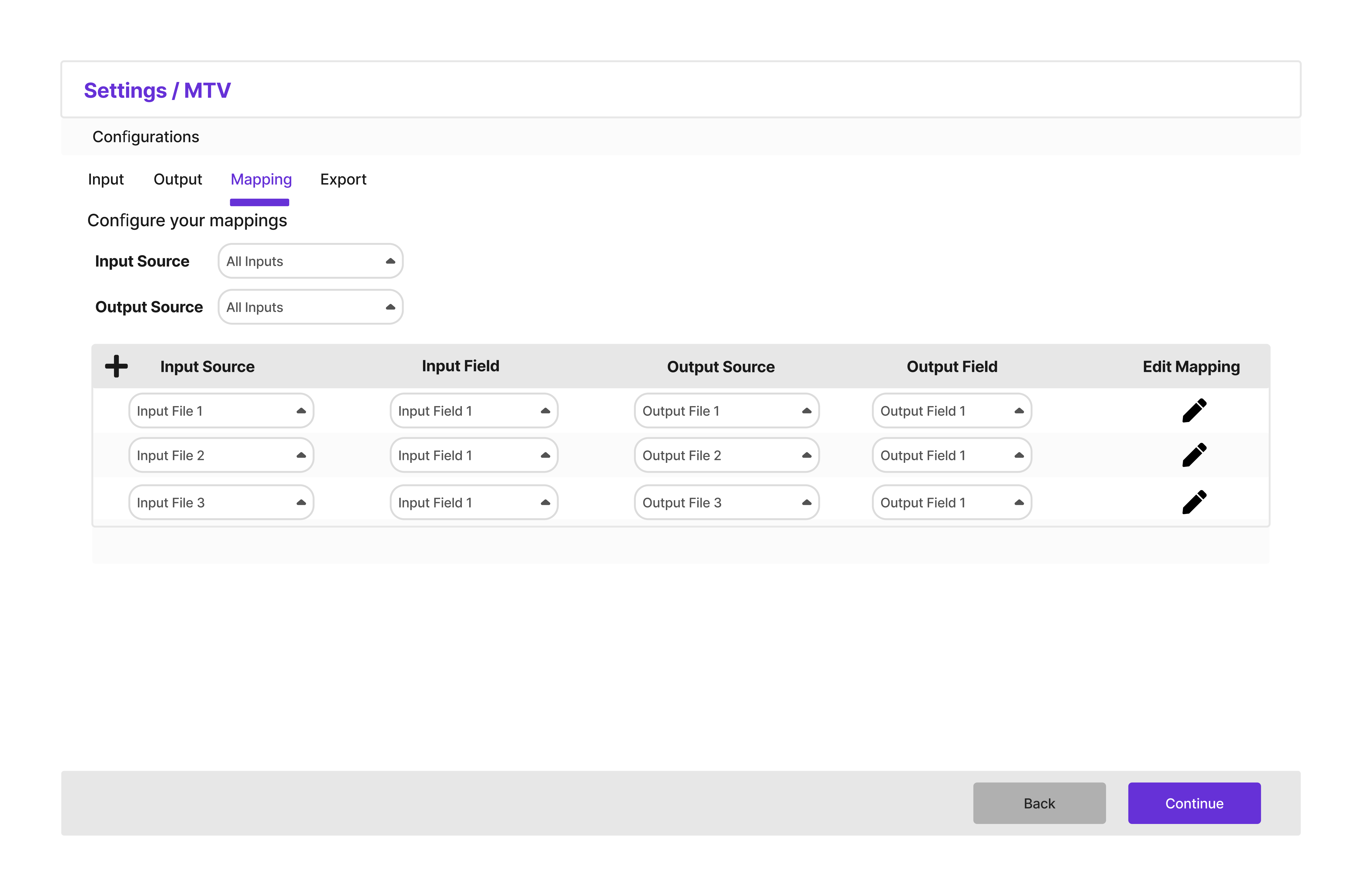
Example: Redesigned Input Files Screen
This is the final proposed design for the input screen, which addresses the confusion identified in the original design by clarifying actions and improving the layout.
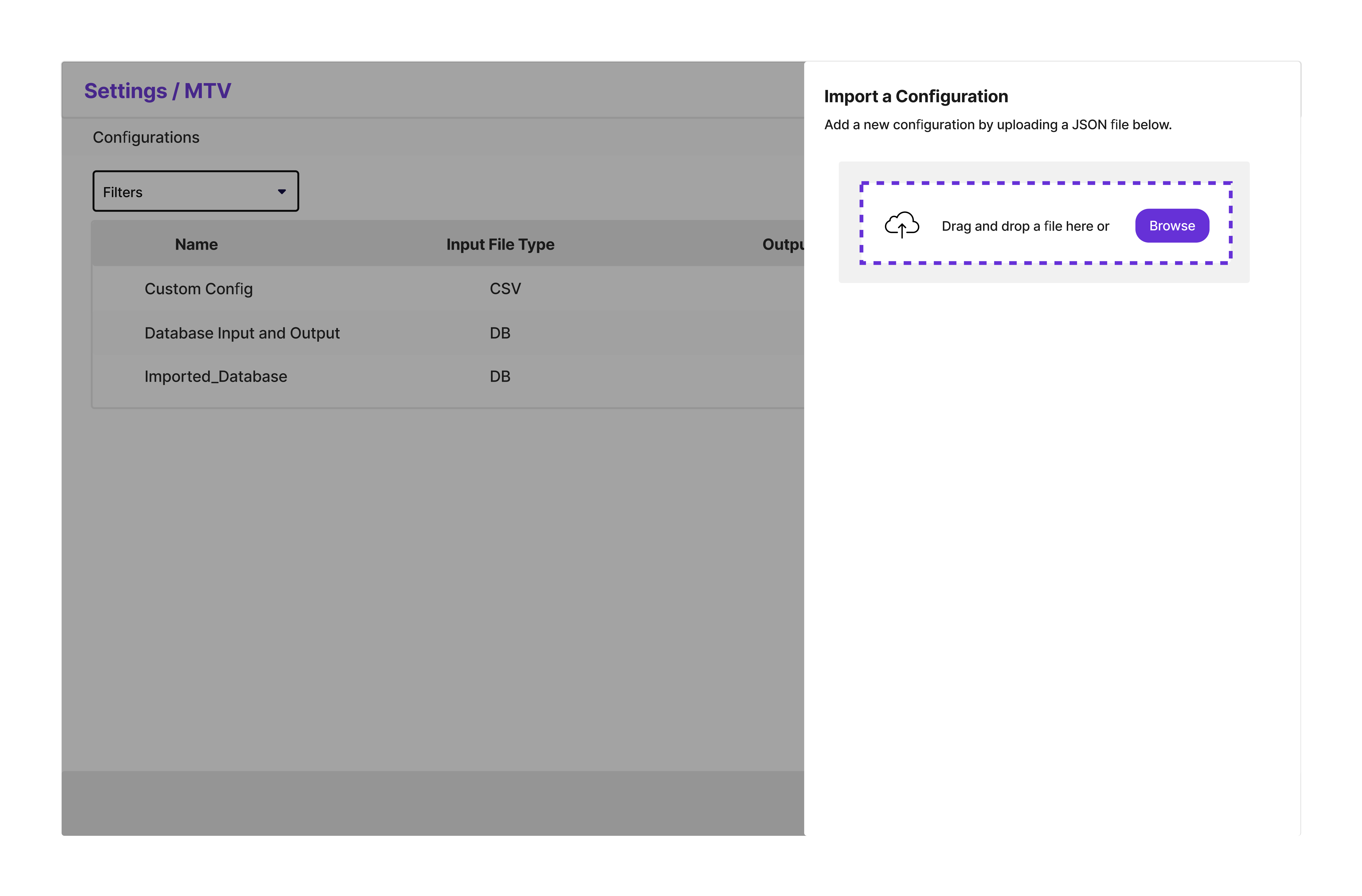
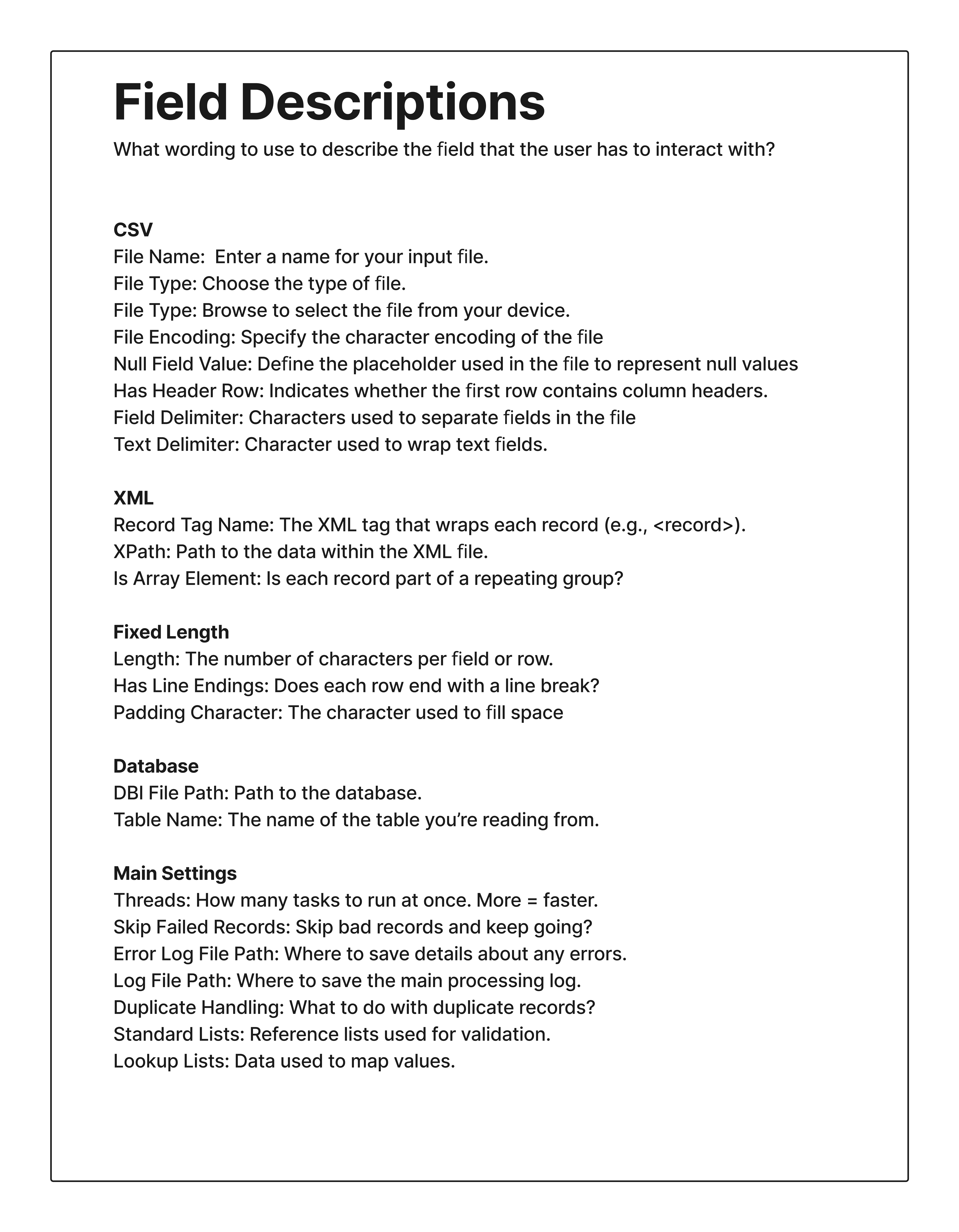
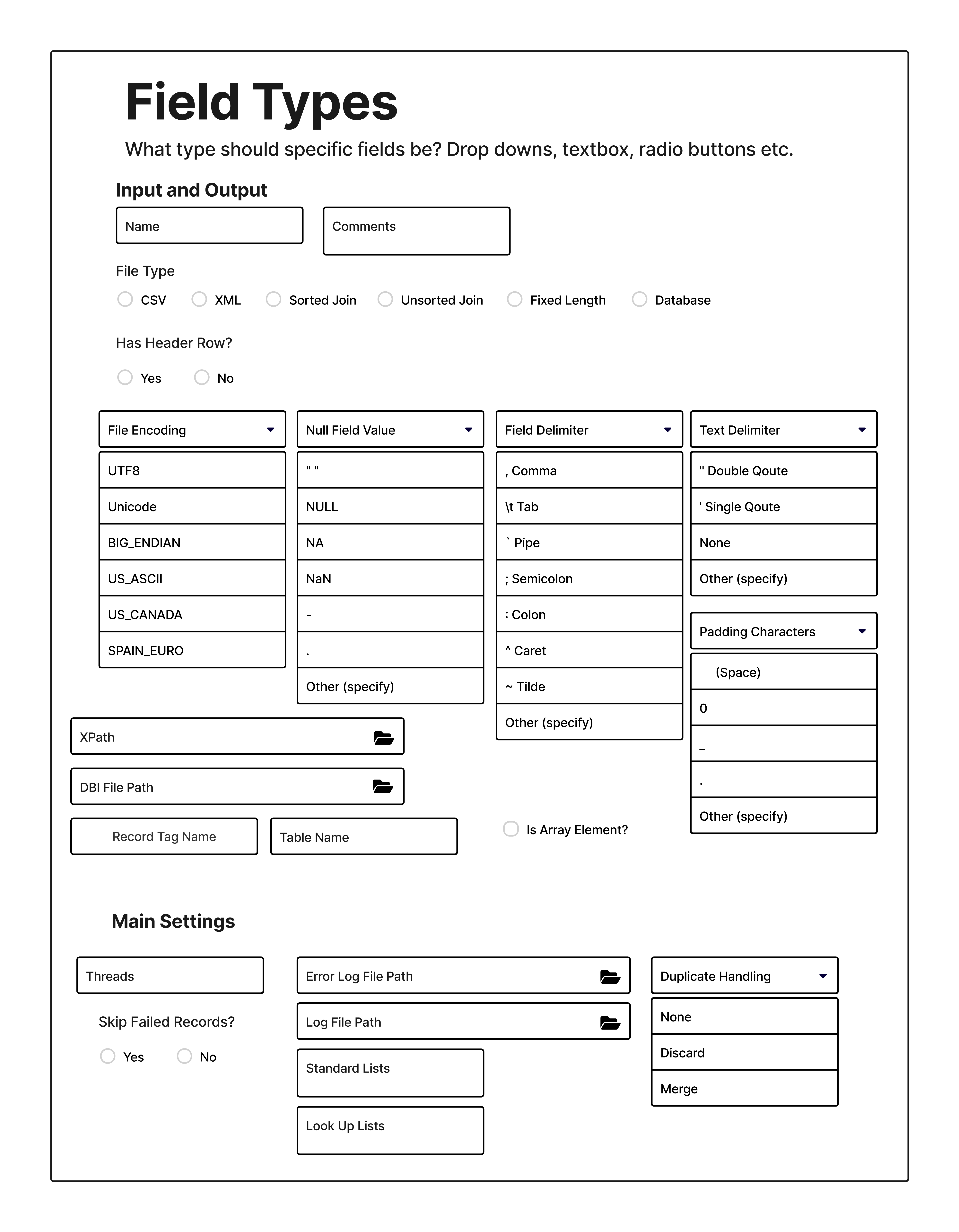
View a selection of prototype screens
06. TESTING
Near the end of this project, I conducted one usability session.
What Worked
The core concept was a success. The user clearly understood the sequential, tab-based nature of the flow. They navigated through each section and understood what was expected of them, validating the overall structural redesign.
Areas for Improvement
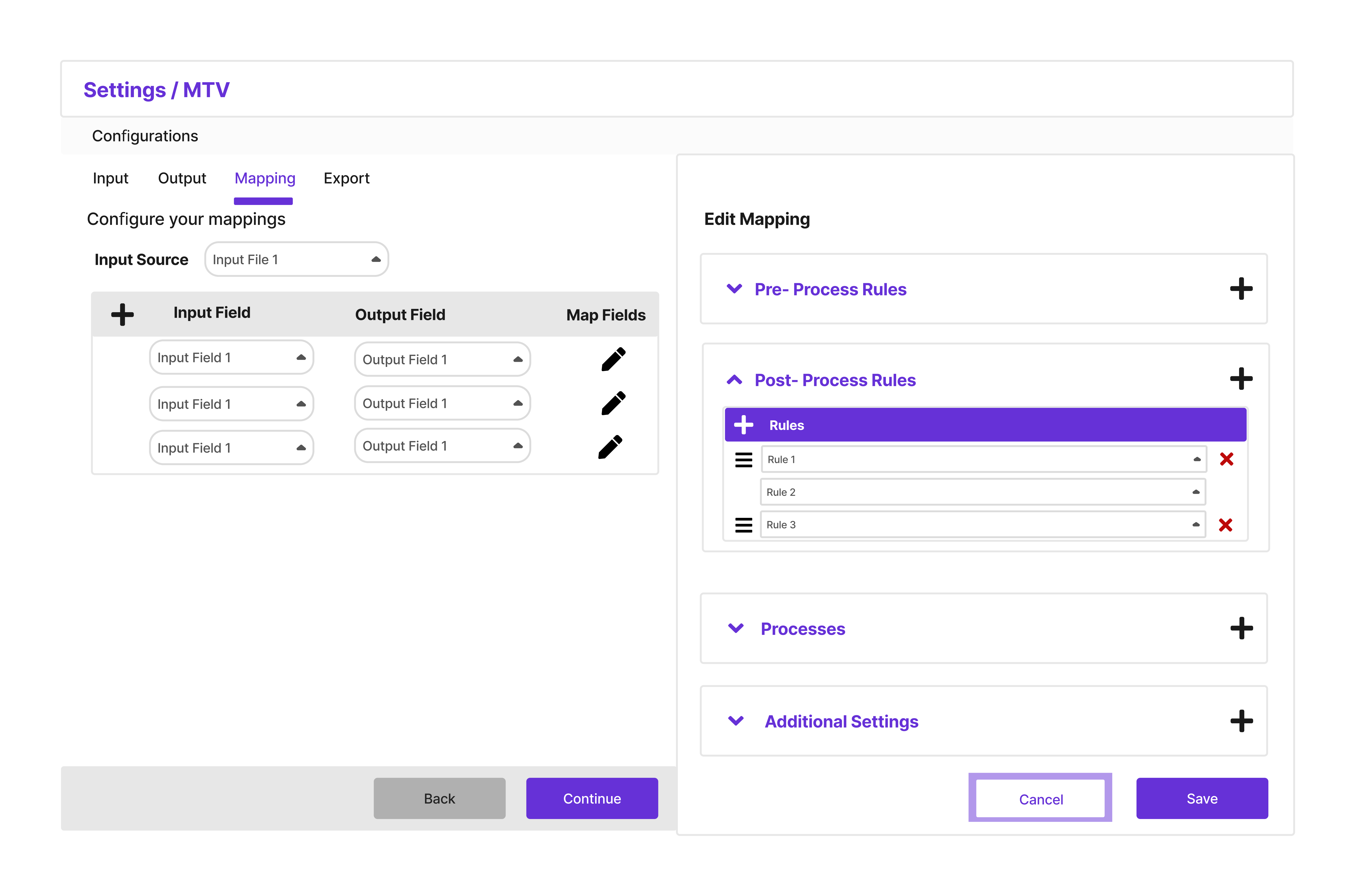
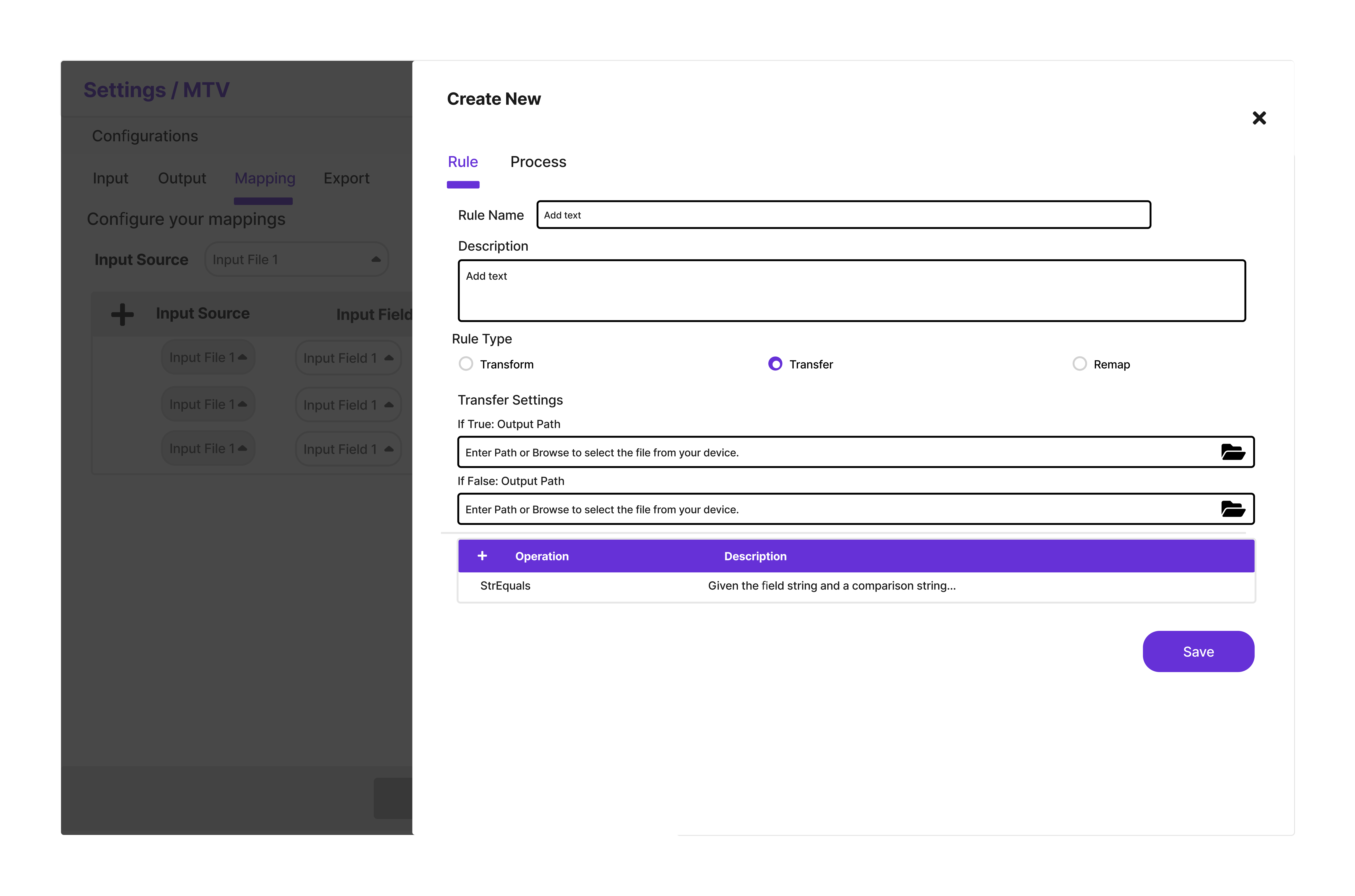
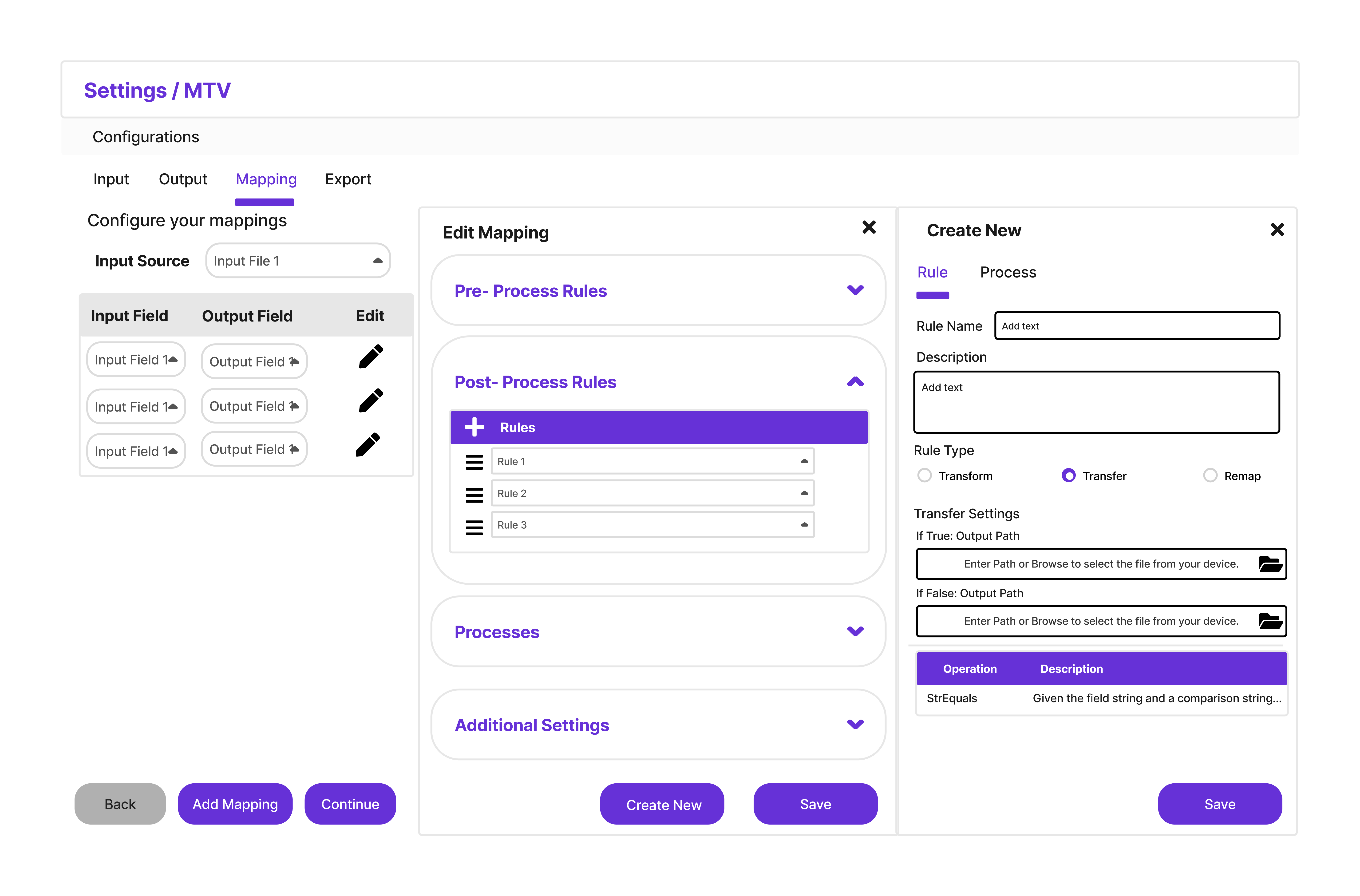
The newly designed mapping page was a major friction point. While the user understood its purpose, they found the interaction model rigid and cumbersome. It was clear this section needed more iteration to meet user expectations.
I was so ready to go back for another round of iteration on the mapping page. Unfortunately, with the internship in its final weeks, time had run out.
07. RESULTS & HANDOFF
Final Presentation
I presented the final prototype and research findings to the Senior Design and Engineering teams with positive feedback.
The Vision Document
To ensure momentum didn't stop when I left, I delivered a comprehensive Vision Document.
08. CONCLUSION & TAKEAWAYS
Things I’d Do Differently
Test earlier.
I should’ve tested more earlier,saving me from obvious misses.
Time-box from day one.
Learning to time-box research was a game changer, but I should have done it from the start.
Think out my stories more.
Too often I'd start working without really knowing what "done" looked like.
The Takeaways
Everything is iterative.
Every single phase requires multiple cycles of refinement. I kept thinking I was "done" with research or ideation, only to circle back with new insights.
Figma is not UX.
I never reached polished high-fidelity designs because that's maybe 5% of the work. The real heavy lifting happens in conversations and strategic thinking.