Enhancing the
RSO Process
The Origin Story
This fall semester, I attempted to establish a User Experience Design club on campus. It was a dreadful experience, but I powered through to the end. But what about those who just couldn’t or wouldn’t? Their ideas aren’t worth any less just because the process is hard.
So, when it came time to pick a project idea in our Methods for Studying Users class, I proposed we try to fix this process. Thus began the project: “Enhancing the Recognized Student Organization (RSO) Process Experience.”
The Problem
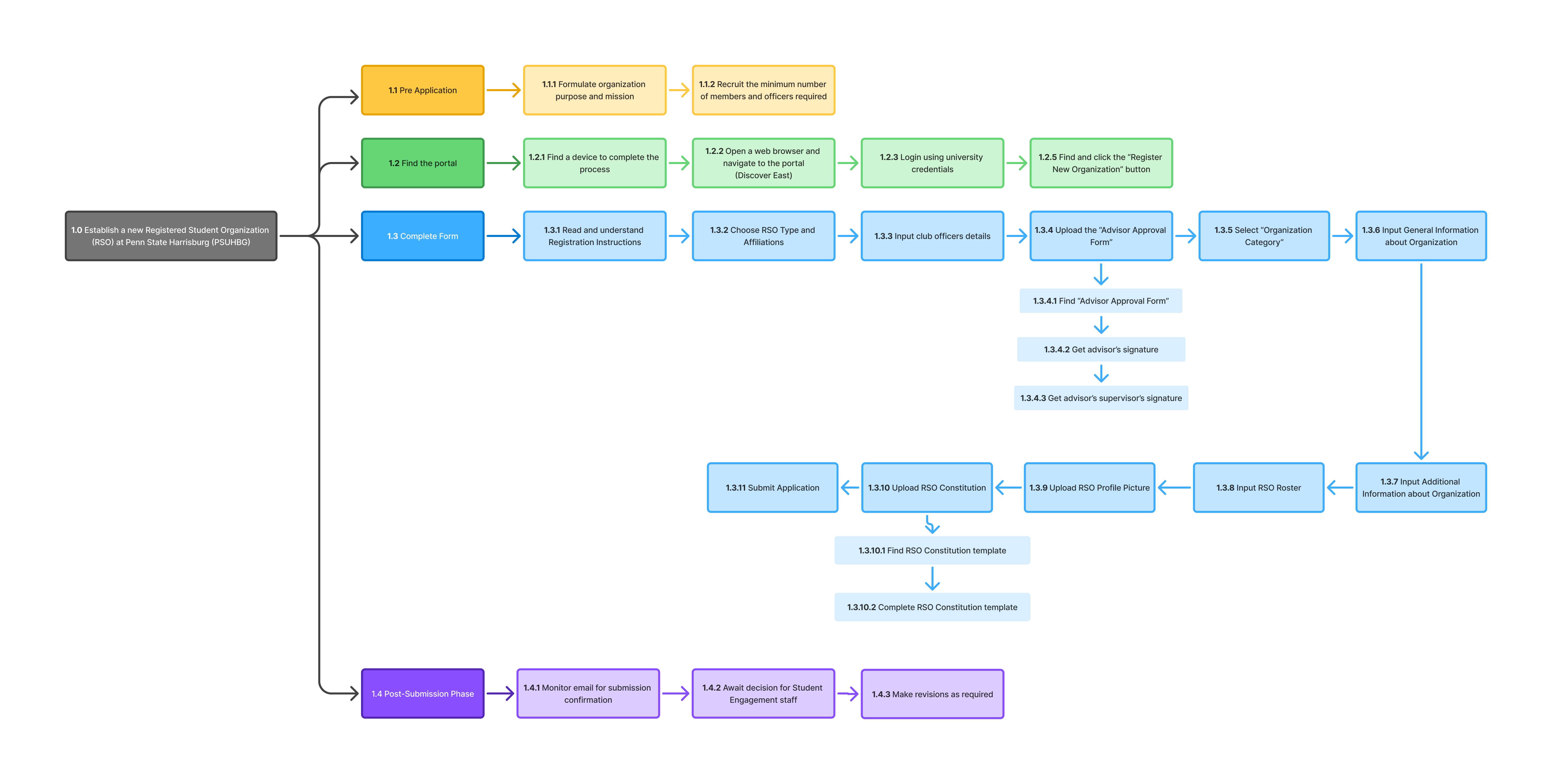
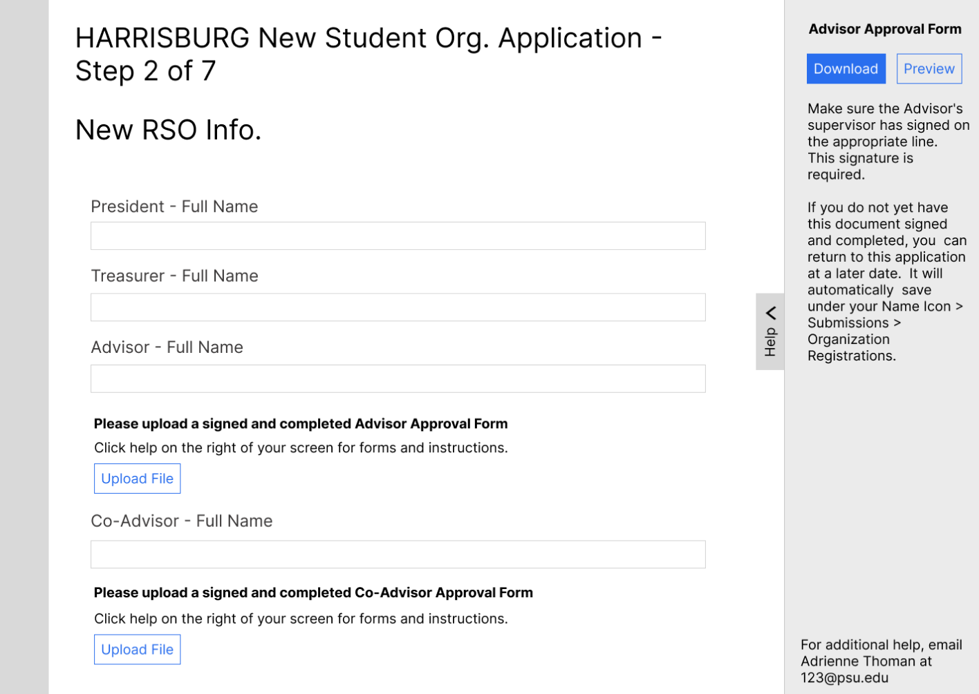
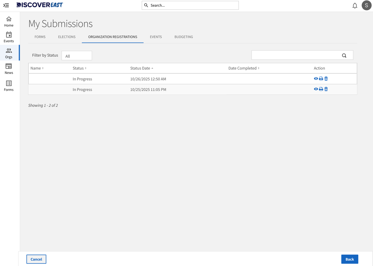
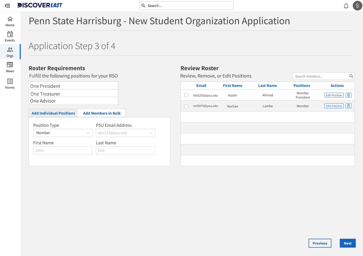
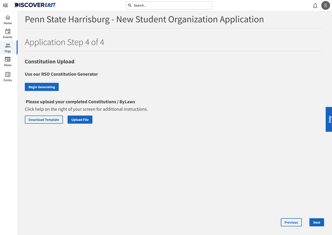
The current RSO registration process consists of filling out an 8-step online application and then waiting for approval. Leading a team of five other members, I set out to figure out if this was a problem at all.
Research: Contextual Inquiry
To gather information, we conducted a Contextual Inquiry. We took a "master-apprentice" approach, observing users perform relevant tasks in their natural environment.
The users were asked to attempt to find and complete the online application and were given no further instruction. The administrators were asked to review a mock application to get an understanding of the back-end process.
To document our findings effectively, we used an A.E.I.O.U map:
- Activities: What actions are they taking?
- Environment: Where are they working?
- Interaction: How do they interact with the system and others?
- Objects: What tools or devices are they using?
- Users: Who is performing the task?
Experienced Users
To understand the expert path.
New Users
To identify fresh friction points.
Administrators
To understand backend constraints.
Synthesis & Findings
After we were done, I was relieved to see I was not the only one who had found issues. Many users found issues all along the application process. We utilized an Affinity Diagram to organize our qualitative data into three themes.
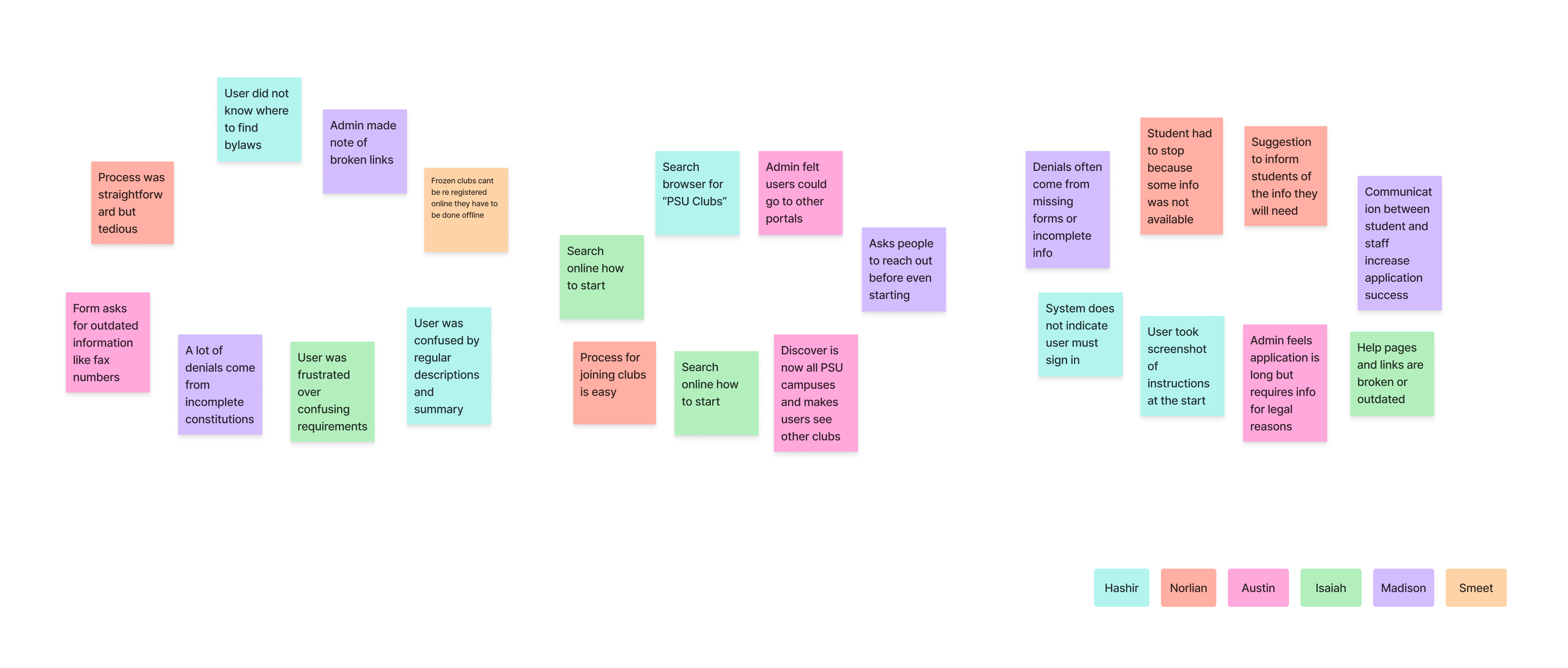
Task Analysis
To put our data to use we conducted a task analysis and used our affinity diagram and three representative tasks from the task analysis as means to track progress.
DISCOVERABILITY
Users struggled to find where to even begin.
INSTRUCTIONS
Information was missing or inaccessible.
FRUSTRATION
General friction, like broken links and missing forms.
Design Exploration
We moved quickly into sketching solutions for the identified friction points.
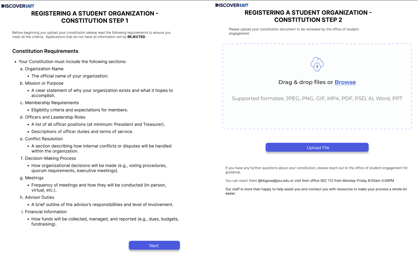
The Goal
Reduce the time it took to complete the application by making it as cohesive and accessible as possible.
Round 1: Usability Testing (The Failure)
We explored sketches to fix the issues above and moved to validation. We conducted a round of moderated usability testing on Zoom (15-20 minute sessions) with 6 target users who were completely new to the platform.
+ What Worked
- The flow of the application once inside was good.
- We fixed all the technical issues (e.g., broken links).
- What Didn't
- Discoverability was still bad.
- The application was still overbearing at the start.
- Inconsistent language confused the team.
- New features weren’t obvious to users at all.
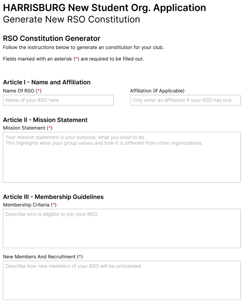
Round 2: Iteration & Validation
Based on this, we went back to sketching and enhanced our designs. For the next round, we mixed our methods:
Another round of Zoom sessions like the previous attempt.
We used Loop11 with a smaller selection of specific tasks.
Results
The results were clear. We needed some minor improvements, but the data showed success:
Time Reduction
-10mins
Cut completion time significantly.
Avg. Completion
12-14m
Down from 20 min benchmark.
Accuracy
100%
Validated by admins as correct.
Impact
We first presented our findings to the Penn State IT Advisory Board, highlighting the critical usability failures in the current system.
Following that success, we were invited to present to the Office of Student Engagement to advise them directly on the redesign roadmap.